PowerGrid Services
A scalable website system for a family of 16 companies, designed to stay consistent underneath while letting each brand look like itself.
Sixteen websites made this a system problem before it was a page-design problem.
PowerGrid covered a family of 16 companies, each with its own logo, typography, colors and imagery. As the sole designer, I knew a beautiful one-off homepage would solve almost nothing. I went in planning a reusable structure that could stay recognizably related underneath while allowing each company to feel like itself. The client wanted the direction clean, modern, strong and straightforward, so I deliberately avoided unnecessary icons, decorative effects and anything that would make the system harder to scale.
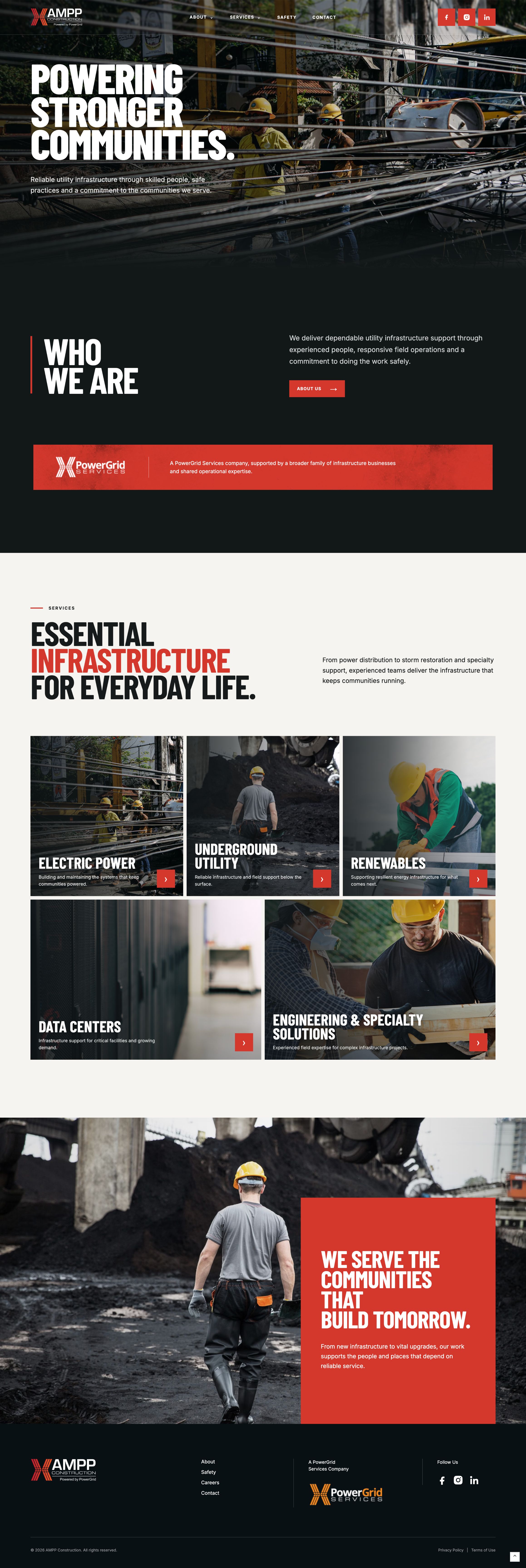

I designed the first direction in the browser early instead of waiting for a perfect handoff.
I built the first variation on staging so the team could experience the actual responsive behavior, spacing and interactions rather than judge everything from static screens. I used practical HTML/CSS, GitHub, Vercel and an AI-assisted workflow to make controlled front-end changes and redeploy quickly. I also built a live brand-variation test across AMPP, CSR and James to prove that the same underlying layout could switch identity without becoming sixteen separate systems.
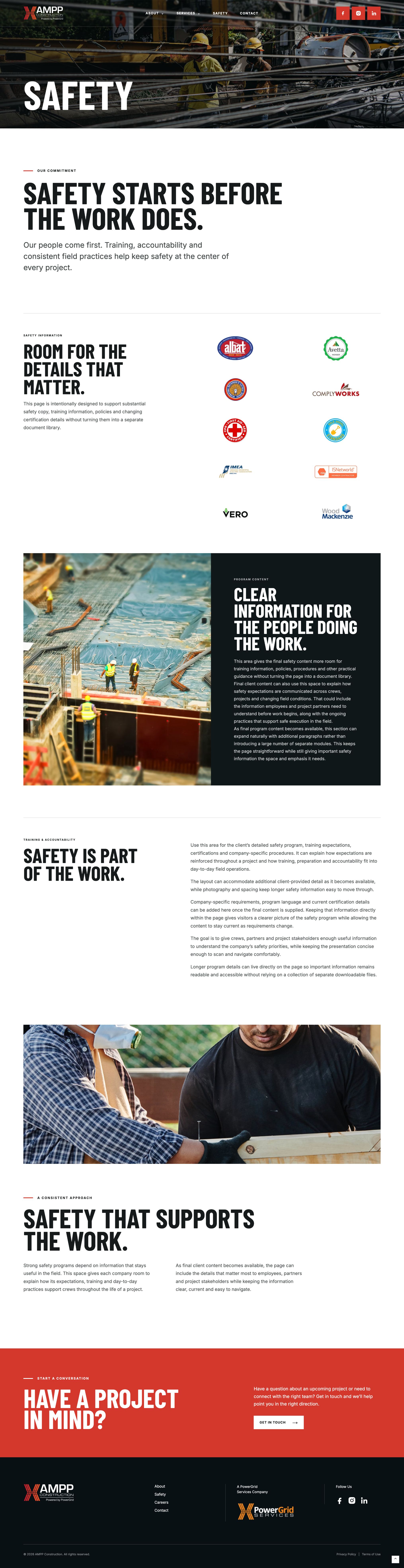
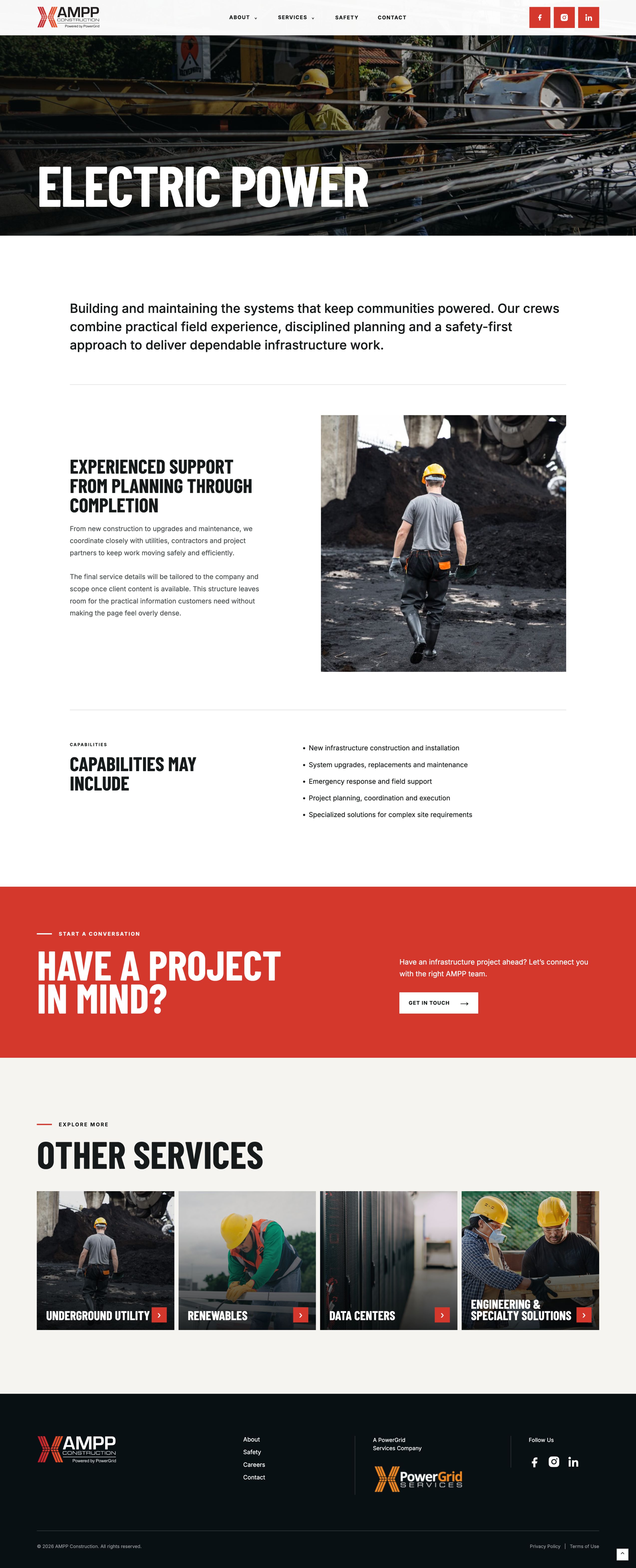
The system makes more sense when you can move through it.
The static screens show the visual system. The live concept shows the pacing, responsive behavior and interactions that connect it.
https://design1-concept.vercel.app/ ↗Implementation became part of the design thinking.
The staging approach made feedback more concrete and exposed feasibility and system decisions earlier. It also meant revisions could happen quickly in something much closer to the final experience. PowerGrid changed how I think about the boundary between design and development: for the right project, getting into the browser sooner can make the design itself better.