Borough of Eatontown, New Jersey
A custom municipal redesign balancing a stronger visual identity with straightforward access to everyday borough information.
The borough wanted a stronger digital presence without making residents relearn the basics.
I approached Eatontown around a familiar public-sector tension: the website should feel current and distinctive, but residents still need low-friction access to departments, notices, meetings and services. My plan was to modernize the visual language while protecting the conventions that make a municipal site immediately understandable, especially for repeat visitors and less technical users.
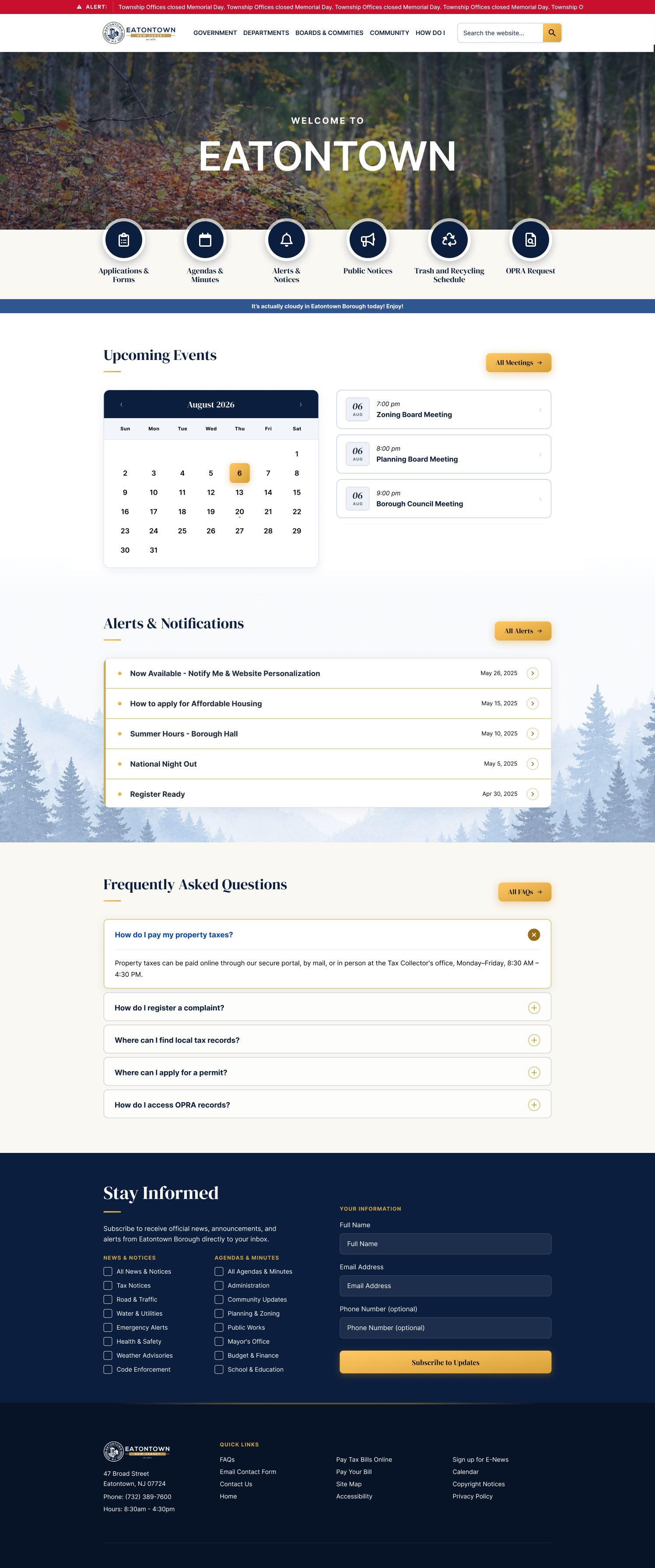

I used visual personality where it helped, and restraint where familiarity mattered more.
I developed a stronger responsive composition, clearer hierarchy and a more intentional visual system, then checked those decisions across desktop and mobile rather than treating the homepage as a single presentation screen. Navigation and service pathways stayed deliberately straightforward while typography, imagery and layout carried more of the identity.
The redesign feels newer without asking the public to work harder.
The final direction gives Eatontown a more confident digital identity while keeping everyday information easy to reach. The project reinforced an important rule for my custom municipal work: modernization is successful when residents notice the site feels better before they notice that anything has become different.