Town of Dalton, Massachusetts
A high-stakes municipal redesign shaped through discovery, three visual directions, accessibility-first decisions and committee-approved responsive UI.
A competitive RFP needed more than a prettier municipal template.
Dalton came in as an RFP / win-back project, so I knew the first job was to understand why the town needed a change before deciding what the new site should look like. I went through the priorities they had shared, the kinds of information residents reach for most often, and the need for a public website that could feel distinctly Dalton without becoming harder to use. Because the audience spans different ages and abilities, accessibility was part of the plan from the beginning, not a final QA pass. I kept readable type, contrast, keyboard and focus states, predictable navigation, clear labels and comfortable content density in mind while shaping the visual direction.
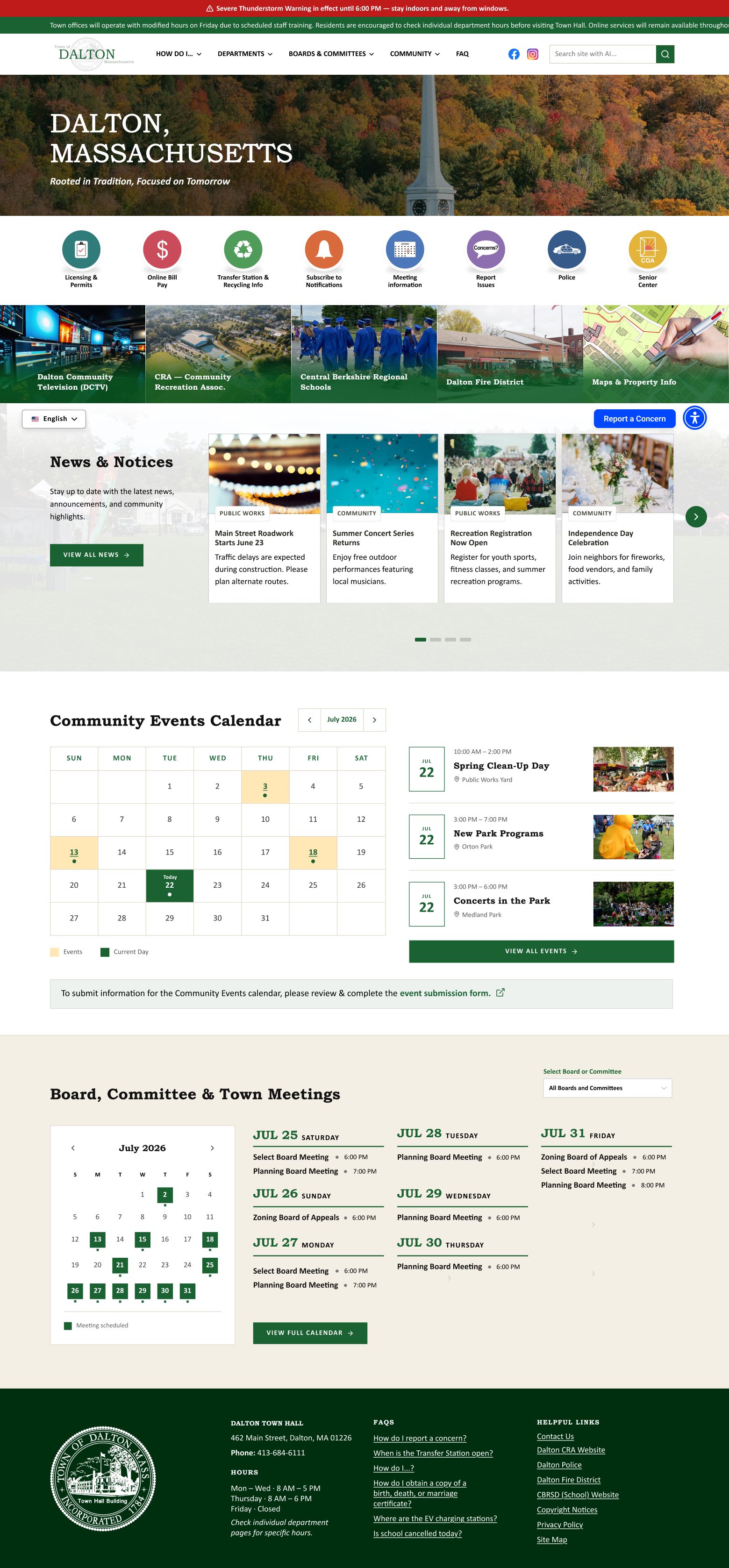

Three directions let me test different answers before asking the client to choose one.
Rather than lock onto the first attractive concept, I built three genuinely different homepage directions. Each interpreted the brief differently while keeping the same usability foundation, so the client could react to real choices instead of abstract adjectives. During review, it became clear that the strongest answer was not one untouched concept: the client liked specific qualities from more than one direction. I treated that feedback as design input, pulled the strongest pieces together and built a more resolved fourth direction from them.
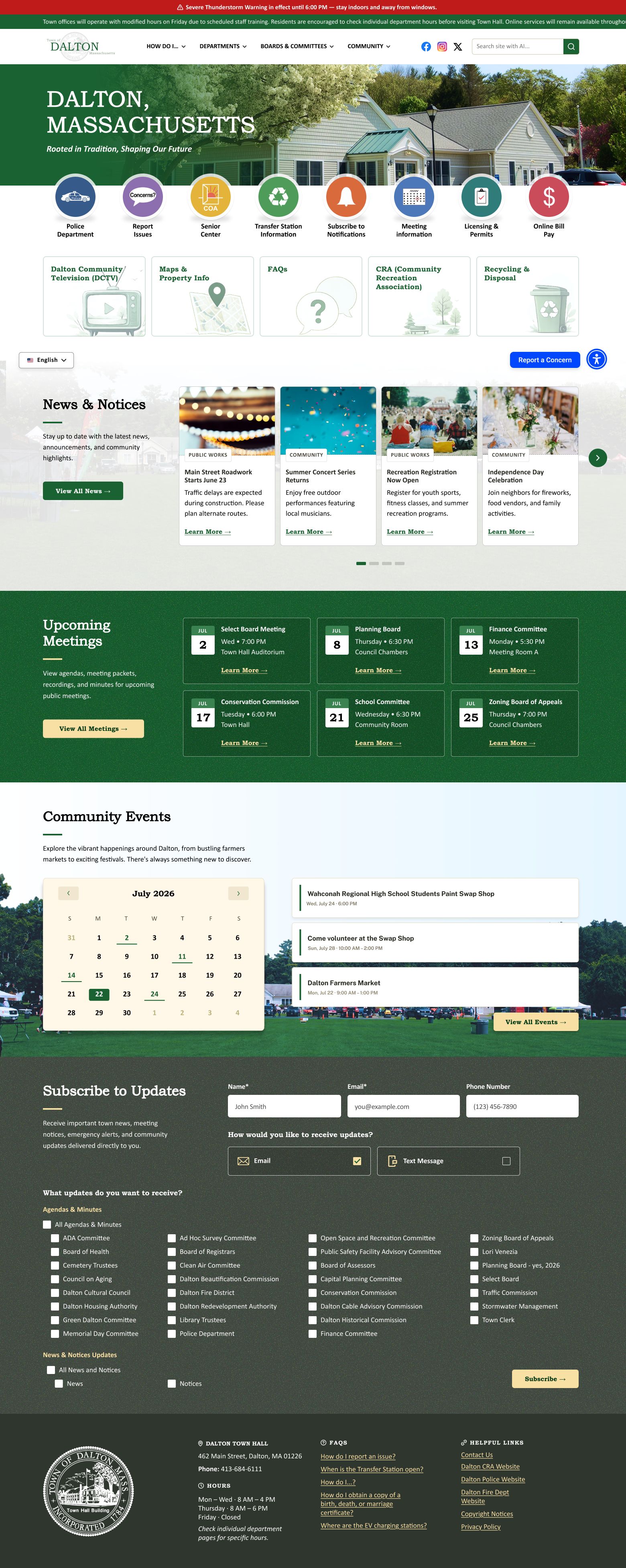
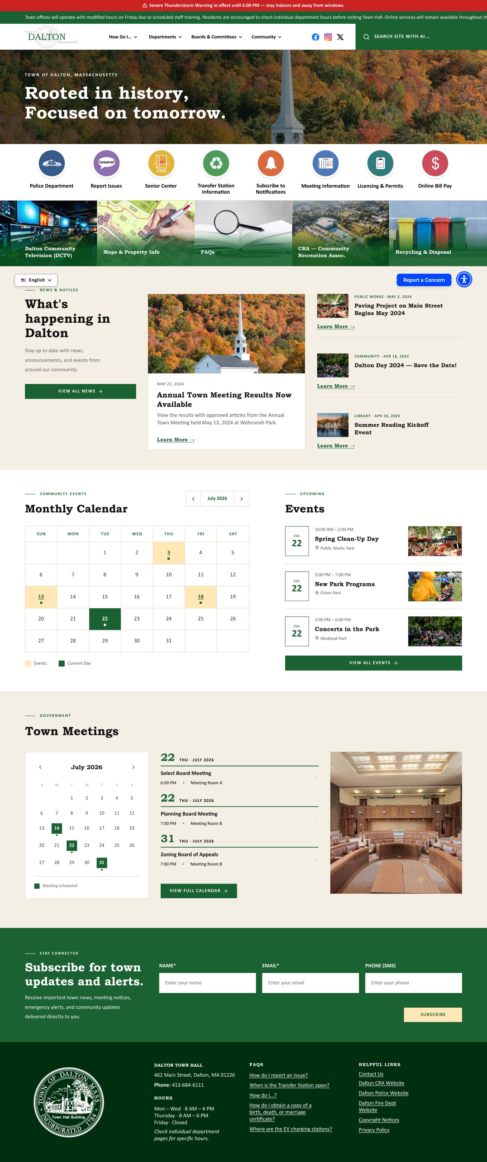
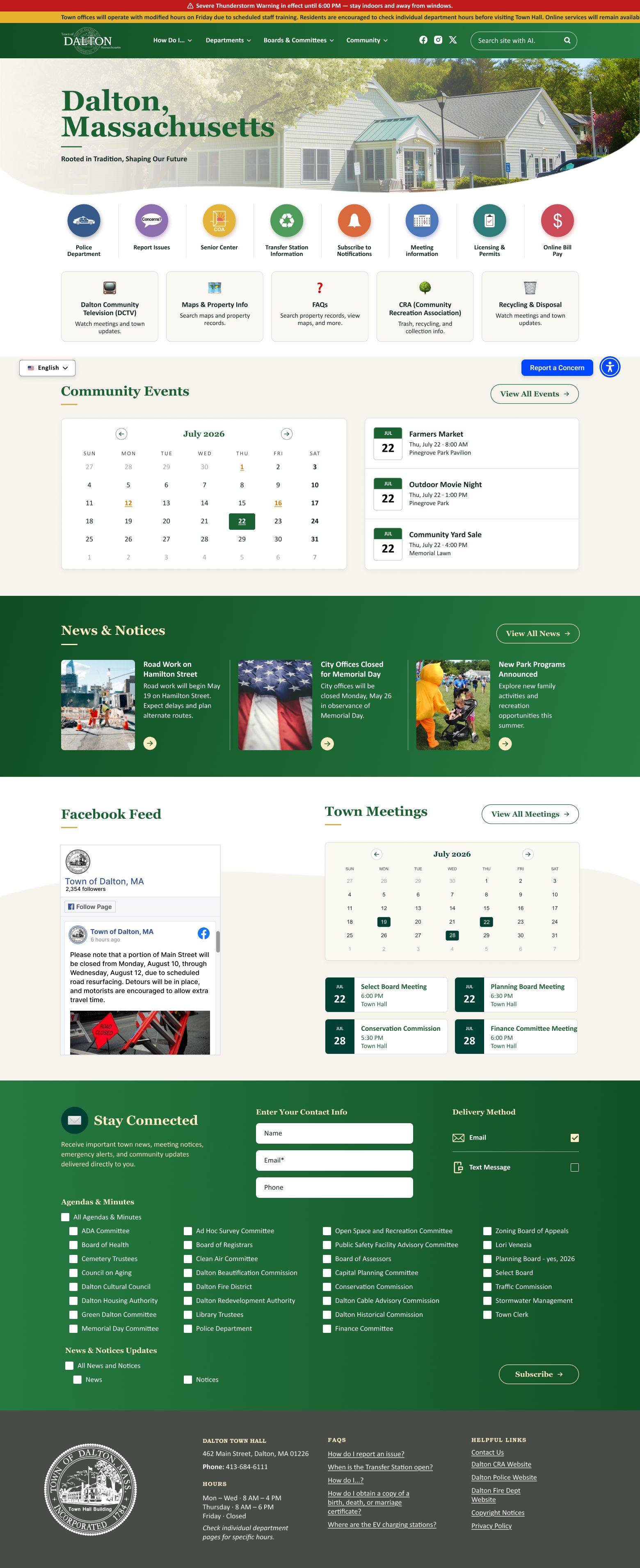
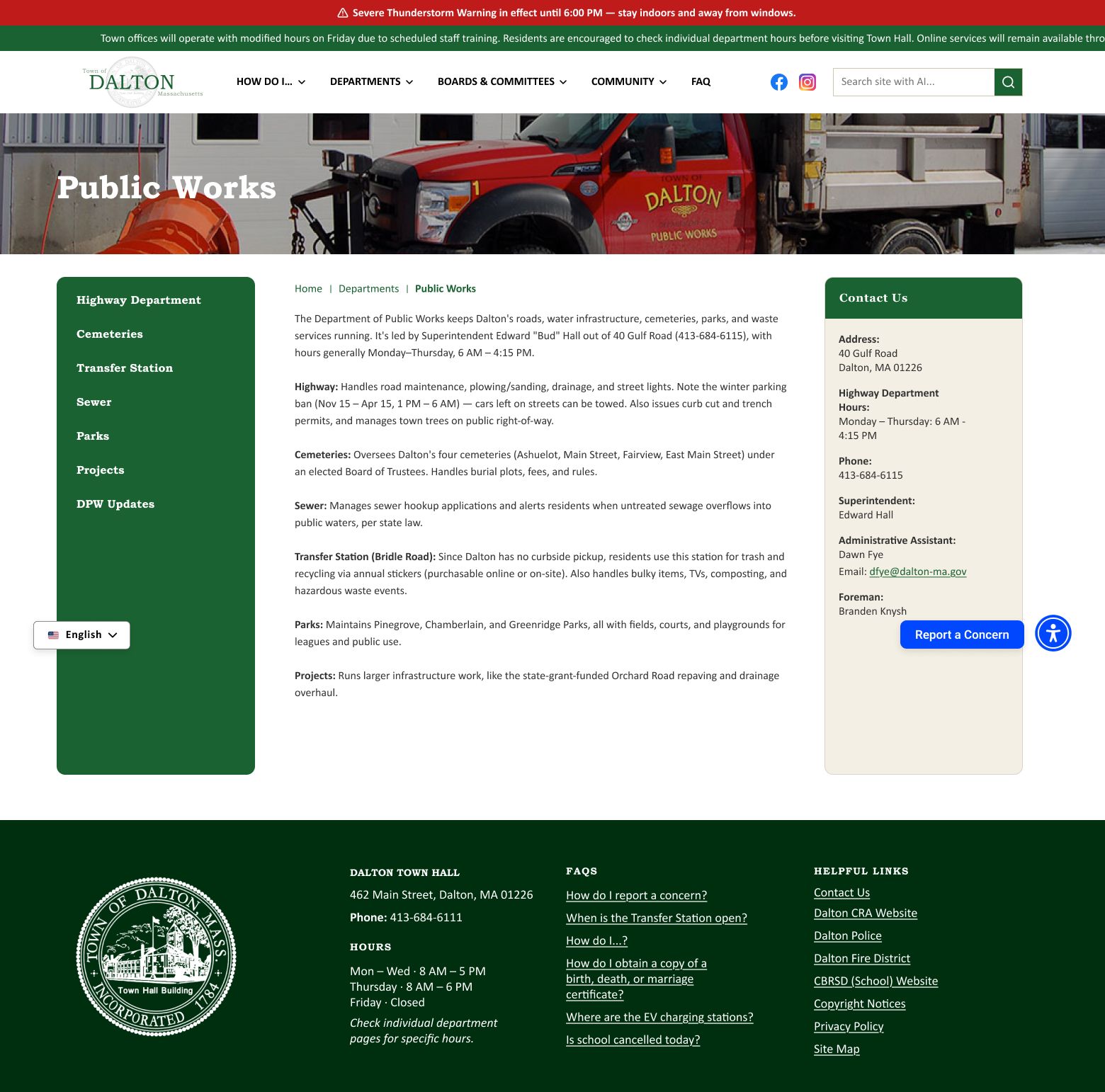

The selected direction had to survive real municipal content, responsive layouts and committee review.
I carried the final system beyond the hero into the full homepage, department page, reusable components and desktop, tablet and mobile behavior. I kept testing whether important actions stayed obvious as layouts compressed and whether long public-sector content still felt scannable. The committee was very pleased with the work and formally approved the homepage and department-page designs for development. Dalton reinforced a process I still use: explore widely when the decision is important, explain the reasoning behind the options, then simplify decisively once the right direction becomes clear.