Complete Safety Concepts
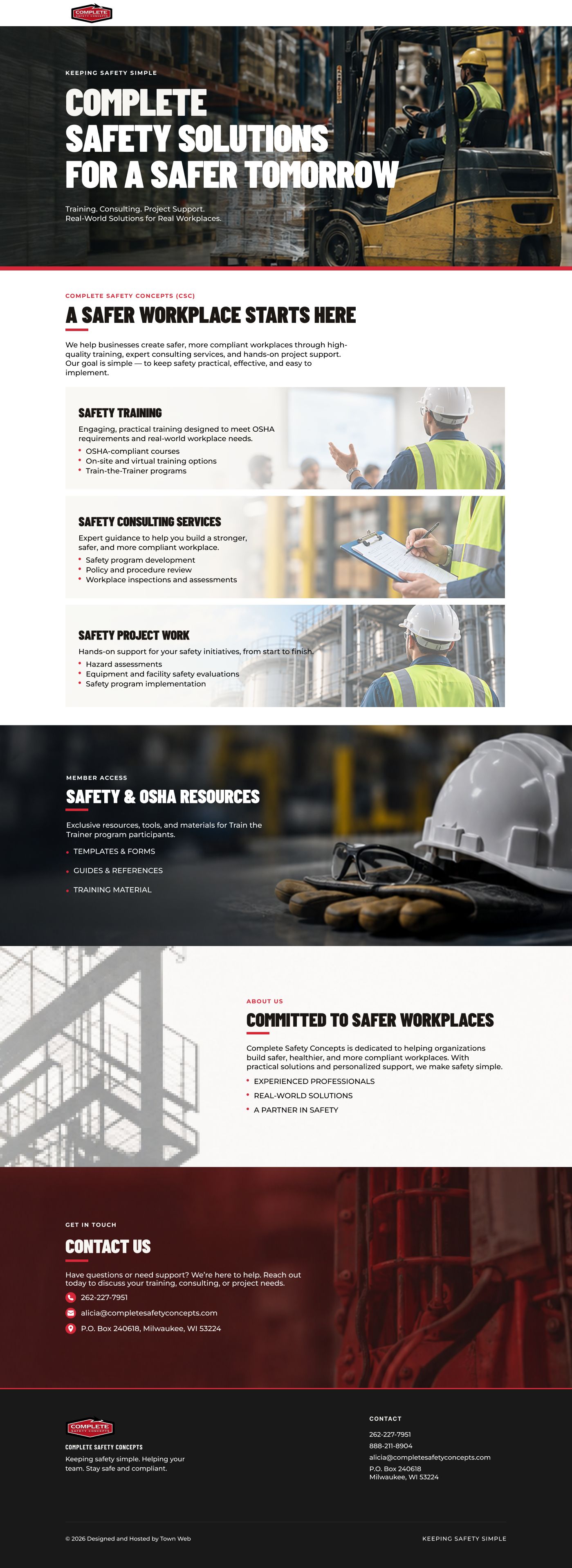
A modern website redesign for a safety training and services company, focused on making a technical offering easier to understand and trust.
A technical service business needed a clearer digital front door.
Complete Safety Concepts had to communicate training, services and technical information without making a first-time visitor work through a wall of industry detail. I went in planning around comprehension and trust: clarify what the company offers, group related information and create obvious entry points before worrying about visual polish.
Professional did not have to mean dense, cold or overly corporate.
I used stronger typography, spacing, hierarchy and cleaner content groupings to make the offering easier to scan while keeping the tone appropriate for a safety-focused business. The visual system was deliberately restrained so important information and actions could lead, rather than decorative elements competing for attention.
The redesign made a complex offering feel more current and easier to understand.
CSC strengthened my discipline with technical service websites: visual polish can earn attention, but structure is what earns understanding and trust. It is a useful counterpoint to more expressive projects in my portfolio because the design decisions are intentionally quieter and more functional.