Town of Cedarburg, Wisconsin
A custom Wisconsin municipal website shaped around clear resident pathways, approachable hierarchy and a homepage that matched the client’s vision.
The homepage needed to feel like a useful front door, especially for residents who do not live online.
I started Cedarburg by thinking about the first few seconds of a visit: can someone understand where to go without learning the website first? Municipal audiences include older residents and people with very different levels of digital confidence, so I kept navigation familiar, labels direct, type readable and important pathways visually obvious. The goal was not to simplify the town’s information by removing it, but to give it enough hierarchy and breathing room that residents could scan it comfortably.
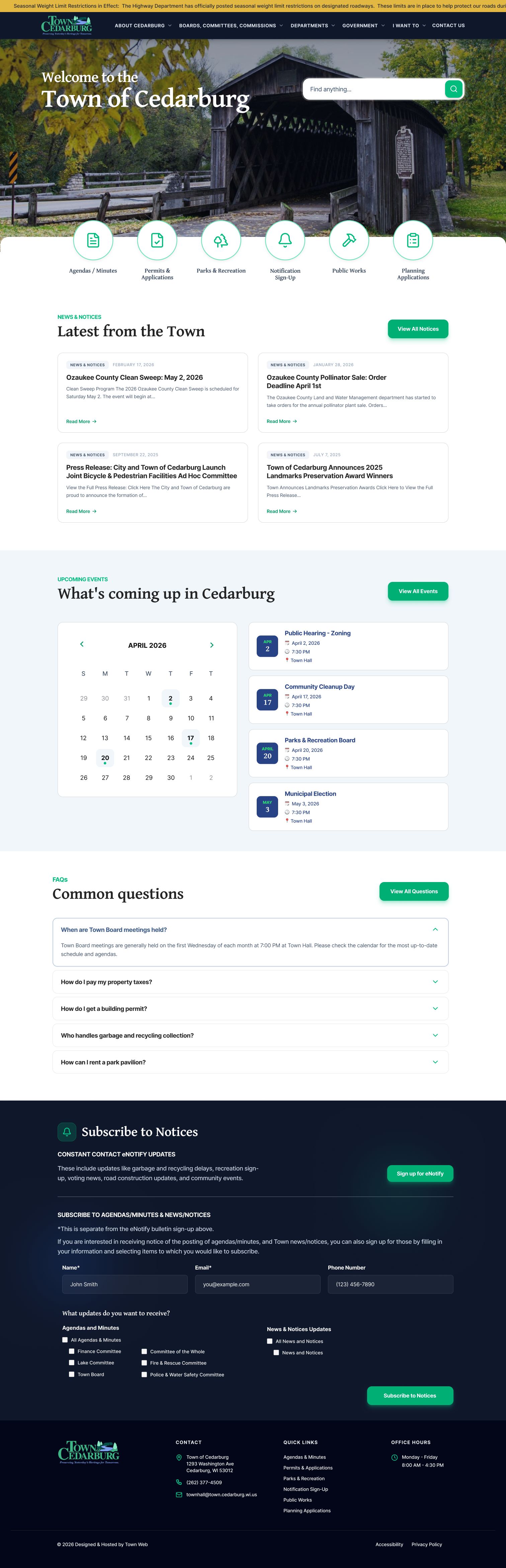

I translated the client’s priorities into a custom direction without adding unnecessary complexity.
I used spacing, typography, imagery and repeatable content patterns to create a stronger identity while keeping the underlying experience calm. I carried the direction through responsive layouts and used the client reveal as a working design conversation, listening for what they were reacting to rather than treating feedback as a list of cosmetic edits.
The client immediately recognized what they had been trying to describe.
During the reveal, the client said the work was “right on with what I was envisioning” and praised how it captured what they had asked for. That response mattered because the project was a reminder that custom municipal design does not need visual tricks to feel considered. Strong listening, clear structure and a few deliberate visual choices can create something that feels both specific and easy to use.